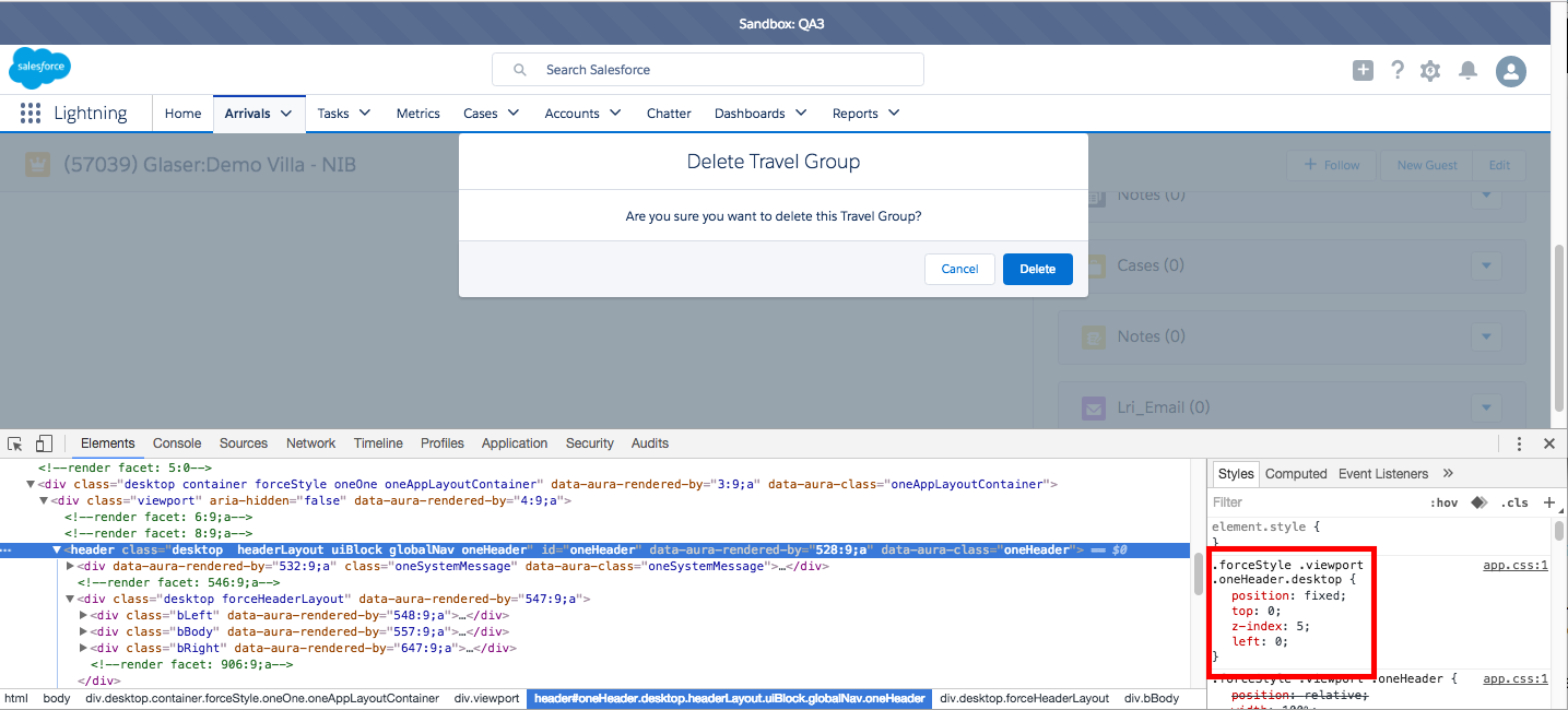
It is because of the header's z-index:
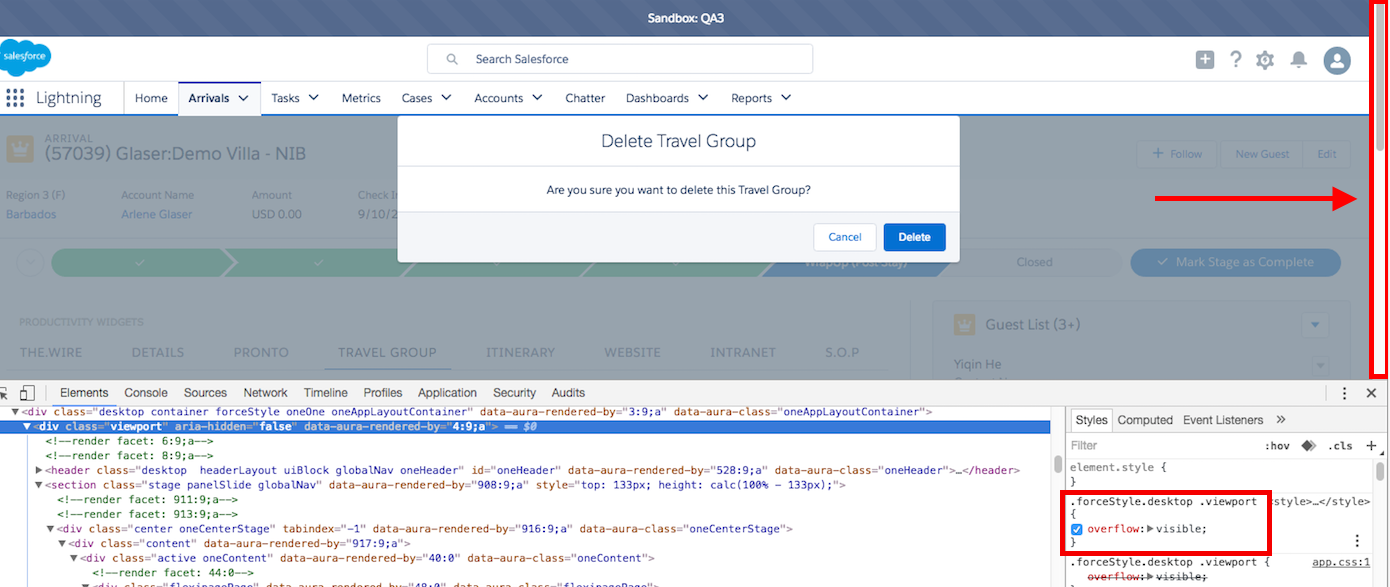
Also, you might not want the page scrollable when the modal is displayed
The workaround is to override the css:
add a < style > block and aura:attribute for the css style
<aura:component>
    <aura:attribute name="cssStyle" type="String" />
    <style>
        {!v.cssStyle}
    </style>
</aura:component>
then add a function in the controller to change the css
overrideHeaderStyle : function(component, event, helper){
    component.set("v.cssStyle", ".forceStyle .viewport.oneHeader.desktop {z-index:0} .forceStyle.desktop .viewport{overflow:hidden}");
}
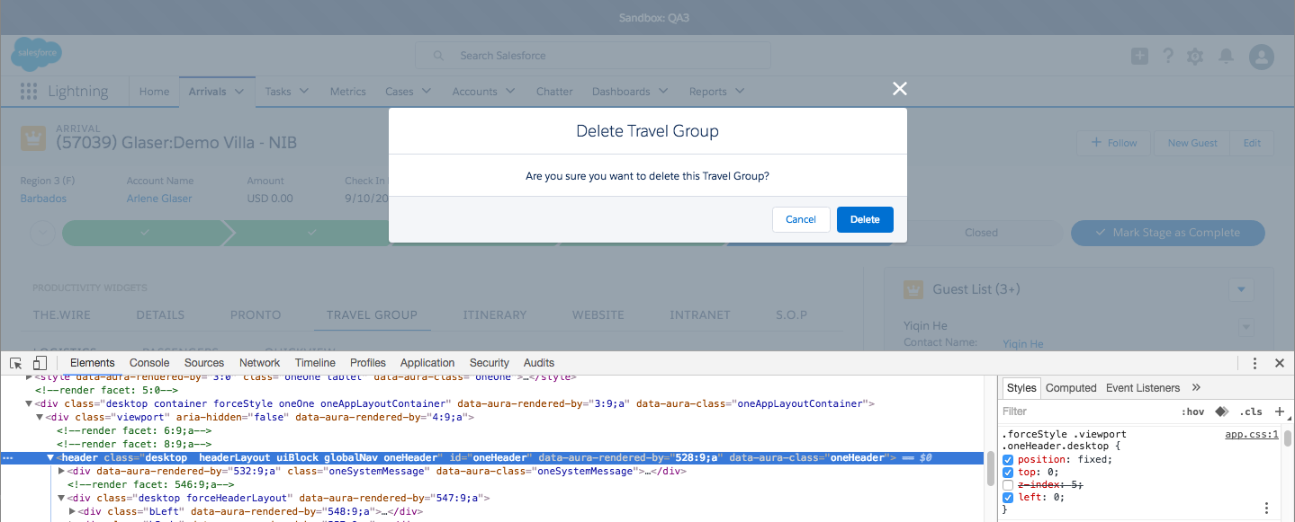
This is the result:
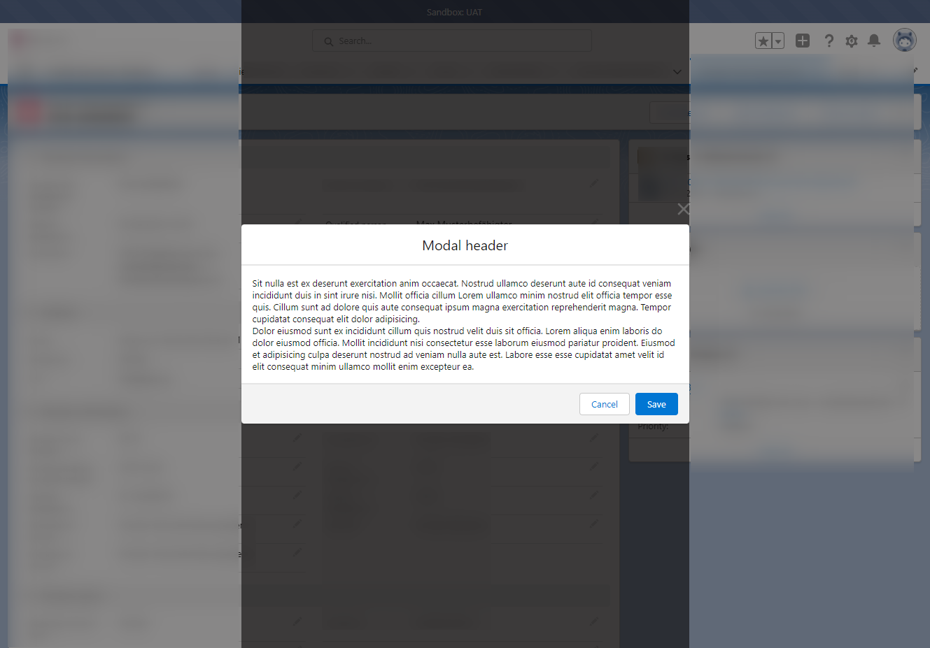
I have implemented something like this. Here is the code :
My modal component which will contain the other component. You will see that this modal take the name of another component as parameter. This is because it will load the other component within itself :
 <aura:component >
<!-- global/shared attributes definition -->
<aura:attribute name="recordId" type="string" description="The record id of the request" />
<aura:attribute name="windowTitle" type="string" description="The title to show on the modal window" />

<aura:attribute name="cmpName" type="string" description="The component name to encapsulate. e.g : c:LC19_GestionMembre" />

<aura:attribute name="showModal" type="boolean" default="true" description="Control the modal view" />

<aura:attribute name="refreshOnClose" type="boolean" default="false" description="If this variable is set to true, then when this modal will close, it will send instruction to the caller component, so that it refresh itself. (The refresh is implemented by the calling component)" />

<aura:attribute name="refresh" type="boolean" default="false" description="tell the calling component that the component has finished execution and can now refresh the set of result" />

<aura:attribute name="showFooter" type="boolean" default="true" description="If set to false, the modal will not display the cancel and save button" />

<aura:attribute name="showHeader" type="boolean" default="true" description="If set to false, the modal will display the title header" />

<aura:attribute name="displayWith" type="boolean" default="true" description="If set to false, the modal will display the title header" />

<aura:attribute name="saveButtonText" type="string" default="{!$Label.c.VFP02Sauvegarder}" description="Component can replace the save text by another text. e.g Executer" />

<aura:attribute name="large" type="boolean" default="false" description="whether to display a 90% modal or 50%" />


<!-- local attributes definition -->
<aura:attribute name="saveTriggered" type="integer" default="0" description="This variable tell the component that the modal save button has been triggered" />

<aura:attribute name="closeTriggered" type="boolean" default="false" description="This variable tell the component to close the modal" />

<aura:attribute name="disableSave" type="boolean" default="false" description="This variable control the state of the save button. It is disabled when action in progress" />

<!-- handlers definition -->
<aura:handler name="change" value="{!v.closeTriggered}" action="{!c.handleClose}" />
<aura:handler name="change" value="{!v.showModal}" action="{!c.loadCmp}" />

<div role="dialog" class="{!v.showModal ? (v.large ? 'slds-modal slds-modal--large slds-fade-in-open' : 'slds-modal slds-fade-in-open'): 'slds-hide'}">
    <div class="slds-modal__container">
        <div class="{!v.showHeader ? 'slds-modal__header': 'slds-modal__header slds-modal__header--empty'}">
            <button class="slds-button slds-modal__close slds-button--icon-inverse" title="Close" onclick="{!c.handleCancel}">
                <lightning:icon iconName="utility:close" size="small" />
                <span class="slds-assistive-text">Close</span>
            </button>
            <h2 class="{!v.showHeader ? 'slds-text-heading--medium': 'slds-hide'}">{!v.windowTitle}</h2>
        </div>

        <div aura:id="xid-cmp-body" class="slds-modal__content slds-p-around--medium slds-is-relative xcs-fix-max-height">
            <lightning:spinner variant="brand" size="small"/>
            <!--####################################################### -->
            <!-- The component is dynamically loaded here -->
            <!--####################################################### -->
        </div>
        <div class="{!v.showFooter ? 'slds-modal__footer': 'slds-hide'}">
            <button class="slds-button slds-button--neutral" onclick="{!c.handleCancel}">{!$Label.c.GLO_Annuler}</button>
            <button class="slds-button slds-button--brand" disabled="{!v.disableSave}" onclick="{!c.sendActionSave}">{!v.saveButtonText}</button>
        </div>
    </div>
</div>
<aura:if isTrue="{!v.showModal}">
    <div class="slds-backdrop slds-backdrop--open"></div>
</aura:if>
</aura:component>
This component in fact share some variable with the other component which will load inside this one. And then when you click on the save button, from the modal, this will trigger an action on the child component which will execute.
Here is the controller :
 ({
    handleClose : function(component, event, helper) {
    var container = component.find("xid-cmp-body");
    container.set("v.body",[]);
    component.set("v.showModal",false);

    if(component.get("v.refreshOnClose")) component.set("v.refresh",true);

},
handleCancel : function(component, event, helper) {
    var container = component.find("xid-cmp-body");
    container.set("v.body",[]);
    component.set("v.showModal",false);
},
sendActionSave : function(component, event, helper) {
    var i = component.get("v.saveTriggered");
    component.set("v.saveTriggered",(i + 1));
},
handleSaveButton: function(component, event, helper) {
    component.set("v.disableSave",component.get("v.inProgress"));
},
loadCmp : function(component, event, helper) {
    var container = component.find("xid-cmp-body");
    //console.log("container :",container);

    if(component.get("v.showModal")){
        console.log("starting loading component");
        //determine which component to load
        $A.createComponent(component.get("v.cmpName"),
                       {"recordId": component.getReference("v.recordId"),
                        "triggerSave": component.getReference("v.saveTriggered"),
                        "triggerClose" : component.getReference("v.closeTriggered"),
                        "triggerCloseInnerModal" : component.getReference("v.closeTriggered"),
                        "actionInProgress" : component.getReference("v.disableSave")},
                       function(cmp) {
                            container.set("v.body", cmp);
                       });
    }

},
  handlePress : function(cmp) {
    console.log("button pressed");
  }
})
Now the child component will have some shared attributes defined. Here is the code for the child component. You will have to readapt it :
 <aura:component controller="LC19_GestionDemandeAcces" >
<!-- global/shared attributes definition -->
<aura:attribute name="recordId" type="string" description="The account id of the request " />


<aura:attribute name="triggerSave" type="integer" default="0" description="This variable is used in the case the component is used in a modal which actually trigger the save action " />
<aura:attribute name="triggerClose" type="boolean" default="false" description="This component tell its modal window to close if this is set to true" />
<aura:attribute name="actionInProgress" type="boolean" default="false" description="This variable is set to true when the server is creating the request" />

<aura:attribute name="disableCustomSave" type="boolean" default="false" description="This variable control the state of the save button. It is disabled when action in progress" />


<!-- handlers definition -->

<aura:handler name="change" value="{!v.triggerSave}" action="{!c.handleSave}" />

<!-- ************************************************************* -->
<!-- ************************** THE BODY SECTION *****************-->
<!-- ************************************************************* -->


</aura:component>
I removed much of the thing. But which is important it to implement the handleSave action in your child component. To close the parent modal, just set the variable triggerClose to false.
Best Answer
Following the rule that you spend days searching for a solution, finally post a question to stackexchange, only to find the solution yourself the next day.
To fix the behaviour I added the following CSS
For calculating the height see also https://stackoverflow.com/questions/28791970/how-to-limit-the-height-of-the-modal