Eric, I suspect your issue is perhaps that you don't have an animation background. What they show on the page you reference are intended more to help demonstrate what happens when the various Lightning Design System "Effects" are applied an object of the same size. They're visual references to illustrate how the effects work when applied to Lightning Design Components.
I have a 3D modeling and animation background. At the top of the page, they mention "3 Principles" which are "Timing", "Elevation" and "Effects". When someone creates an animation or movie, they begin by "story-boarding" it. Later, they move on to "keyframing", which is deciding where they want their objects to be and in what "state" at a specific time in the animation.
Animations are sometimes broken down into "sub-animations", particularly when part of it is repetitive, such as when something vibrates, the legs of a body move as a person walks, their arms swing in rhythm, etc. The same could be said of "squish and squash" effects as a ball bounces.
When the documentation speaks of elevation, they're referring to front and back or "screen depth" where one object will appear as though it's in front or behind another. That allows objects to cast shadows on each other or to appear initially close, then move further away as it shrinks in size on the screen, perhaps even becoming partially obscured by other objects in the animation.
Depending on the type of animation one desires to create, they will "ease in" or "ease out" of transitions. Either that or they will use some other form of "non-linear" transition to make things appear more natural or to illustrate "anticipation". The use of exaggeration is often necessary with animations to convey the desired effect. Watch old Mickey Mouse or Bugs Bunny cartoons and you'll readily see what I mean.
The effects illustrated on the page you've referenced are meant to be used in combination with one another to achieve an overall desired animation that's only limited by one's imagination and the commands available to you along with the frame rates a user will be able to view (ideally 30 frames/sec).
There are many books available on the subject of animation and loads of software for creating them. I recommend you purchase a book on the basics that will help you better understand how to apply those principles using the commands available with the Lightning Design System. I don't think the documentation is intended to teach how to "animate" so much as provide you with examples of what each command does so you can decide how you might choose to utilize it to enhance your pages.
So here is my two cents
Note Per comments this does not seem to completely answer the question as OP is looking to keep classic look while providing a look that also appears well under Lightning using a single solution.
For VF components that you want to style as SLDS without having to modify the controller you need to de-componetize them. Adding styles after the DOM has been rendered as pointed out above is not great because it relies on implementation level details you have no control over. Not to mention it is just hacky...
Also, VF components just do a lot of the work for us. Unfortunately, with SLDS we are again going to need to do much of the HTML work ourselves but it is not really that bad.
Using a template approach like mentioned What is suggested approach to transfer VF pages to be lightning ready
So the idea for the code you posted would be to:
- Pageblocktable becomes an HTML table
- Use an apex repeat to build the table rows using the controller variable
- Use an input/output field with the appropriate slds styleclass in each table row
You can maintain controller and page functionality while doing this.
Bottom line is you will need to break these compound tags into HTML elements. Simple tags like input field can be used as is with the appropriate styleclass and surrounding HTML elements thus allowing you to keep built in functionality
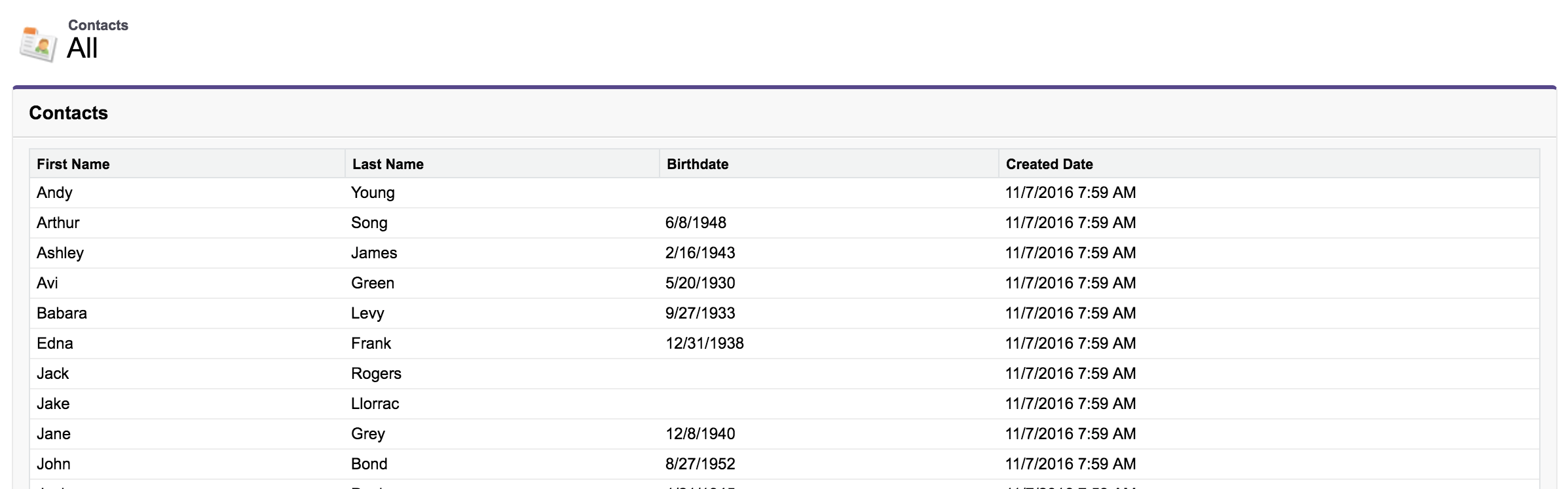
Original Markup
<apex:page standardController="Contact" recordSetVar="cs">
    <div class="slds cv">
        <apex:form>
            <apex:sectionHeader title="{!$ObjectType.Contact.labelPlural}" subtitle="All"/>
            <apex:pageMessages />
            <apex:pageBlock title="{!$ObjectType.Contact.labelPlural}">
                <apex:pageBlockTable value="{!cs}" var="c">
                    <apex:column value="{!c.FirstName}"/>
                    <apex:column value="{!c.LastName}"/>
                    <apex:column value="{!c.Birthdate}"/>
                    <apex:column value="{!c.CreatedDate}"/>
                </apex:pageBlockTable>
            </apex:pageBlock>
        </apex:form>
    </div>
</apex:page>
Output
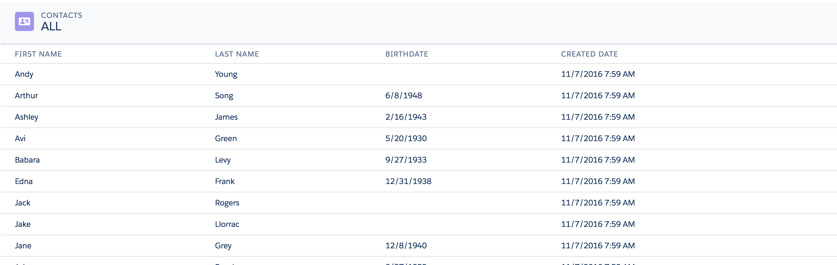
SLDS Pageblock / Pageblocktable Markup
A bit more markup but the way it is done ensures that it continues working and does not rely on the "implementation level details" of the old VF components
<apex:page id="dummySLDSPage" standardController="Contact" recordSetVar="cs" showHeader="false"
standardStylesheets="false" applyHtmlTag="false" applyBodyTag="false" docType="html-5.0">
<head>
<apex:stylesheet
value="{!URLFOR($Resource.SLDS, 'assets/styles/salesforce-lightning-design-system-vf.min.css')}"/>
</head>
<div class="SLDS">
<body>
<apex:form>
<apex:pageMessages/>
<!-- Replaces the Standard Pageblock Table Header-->
<div class="slds-page-header" role="banner" xmlns="http://www.w3.org/2000/svg"
xmlns:xlink="http://www.w3.org/1999/xlink">
<div class="slds-grid">
<div class="slds-col">
<div class="slds-media slds-no-space slds-grow">
<div class="slds-media__figure">
<svg aria-hidden="true" class="slds-icon slds-icon-standard-contact">
<use xlink:href="{!URLFOR($Resource.AppFrontier_Assets, '/assets/icons/standard-sprite/svg/symbols.svg#contact')}"></use>
</svg>
</div>
<div class="slds-media__body">
<p class="slds-text-title--caps slds-line-height--reset">{!$ObjectType.Contact.labelPlural}</p>
<p class="slds-page-header__title slds-truncate"
title="ALL">ALL</p>
</div>
</div>
</div>
</div>
</div>
<!-- Replaces the Pageblocktable Table -->
<table class="slds-table slds-table--bordered slds-table--cell-buffer">
<!-- Use a caption if desired
<caption class="slds-text-heading--label slds-p-bottom--medium">{!$ObjectType.Contact.labelPlural}</caption>
-->
<thead>
<tr class="slds-text-title--caps">
<th scope="col">
<div class="slds-truncate" title="{!$ObjectType.Contact.fields.FirstName.Label}">
{!$ObjectType.Contact.fields.FirstName.Label}
</div>
</th>
<th scope="col">
<div class="slds-truncate" title="{!$ObjectType.Contact.fields.LastName.Label}">
{!$ObjectType.Contact.fields.LastName.Label}
</div>
</th>
<th scope="col">
<div class="slds-truncate" title="{!$ObjectType.Contact.fields.BirthDate.Label}">
{!$ObjectType.Contact.fields.BirthDate.Label}
</div>
</th>
<th scope="col">
<div class="slds-truncate" title="{!$ObjectType.Contact.fields.CreatedDate.Label}">
{!$ObjectType.Contact.fields.CreatedDate.Label}
</div>
</th>
</tr>
</thead>
<tbody>
<apex:repeat value="{!cs}" var="c"> <!-- Build the columns -->
<tr>
<th scope="row" data-label="{!$ObjectType.Contact.fields.FirstName.Label}">
<div class="slds-truncate" title="{!c.FirstName}">
<apex:outputField value="{!c.FirstName}"/> <!-- Standard VF component -->
</div>
</th>
<td data-label="{!c.LastName}">
<div class="slds-truncate"
title="{!c.LastName}">
<apex:outputField value="{!c.LastName}"/>
</div>
</td>
<td data-label="{!c.Birthdate}">
<div class="slds-truncate"
title="{!c.Birthdate}">
<apex:outputField value="{!c.Birthdate}"/>
</div>
</td>
<td data-label="{!c.CreatedDate}">
<div class="slds-truncate"
title="{!c.CreatedDate}">
<apex:outputField value="{!c.CreatedDate}"/>
</div>
</td>
</tr>
</apex:repeat>
</tbody>
</table>
</apex:form>
</body>
</div>
</apex:page>
Output
The general idea would apply to the rest of the items you would like to convert. You could even go so far as spending a bit of time to make VF Components that are done in SLDS styling and used to replace existing VF components. If the project is large this could be beneficial as it would save a lot of time.
Maybe I should put a package of reusable replacement SLDS components for VF components together...hmm...There is already a library out there but it had way too much overhead and really hacked the styling.
Some additional resources:
VF SLDS Checkbox: SLDS and inputField checkbox
VF SLDS Lookup with autocomplete: Lookup Field Dual Keyboard Focus (Answered with working Autocomplete lookup component and JS example for VF/SLDS)
VF SLDS Select Checkboxes: Convert apex:selectCheckboxes into slds style
VF Page Messages Replacement: How to convert a Visualforce apex:pageMessages to be lightning style
Best Answer
No standard component available as of now, but this article might be helpful. It contains sample repo which leads to working custom stencil component. It uses LWC for the structure.
https://devlife.tech/index.php/2020/06/22/how-to-use-stencils-in-lightning-web-component
Let us know if it helps.