I'm desperately trying to display a modal in Salesforce1, but can't make it work.
My component display information that doesn't fit on one screen so I need to scroll. Problem is that SLDS Modal will show up in the middle of my whole page instead of the middle of the currently displayed screen. So depending on where the user currently is on the page, he may not see the modal and need to scroll.
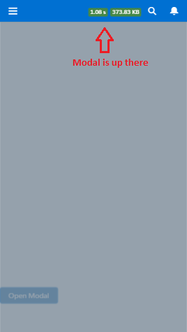
Here you can see that while being at the bottom of the page, I can't see the modal which is in the middle of the screen (so the only way to see it is to scroll up, at least if the user understand that there is something to see somewhere!):
As displayed here, Lightning Design System's modal isn't working because of a Salesforce1 bug.
Also, from what I understand from here, this is because SF1 is using a custom JS scrolling feature instead of standard web browsers one, and this breaks everything I tried in Salesforce1:
- I tried to use CSS "position: fixed;" but this doesn't work
- I tried to use JS "pageY" to get the clicked position and display the modal right there, but pageY returns an incorrect value in SF1
- I tried to display the modal at the very top of the page and use JS "scrollTop" doesn't work
So I don't know how to display a modal in the center of the user screen, or even make some dirty workaround work like display the modal at the top and scroll to it.
Here is the code of a sample component that has the issue:
Component
<aura:attribute name="displayModal" type="Boolean" default="false"/>

<div style="height:1500px"></div>

<button class="slds-button slds-button--brand" type="button" onclick="{!c.showModal}" id="test">Open Modal</button>

<aura:if isTrue="{!v.displayModal}">
    <div>
        <div aria-hidden="false" role="dialog" class="slds-modal slds-fade-in-open">
            <div class="slds-modal__container" role="document" tabindex="0">
                <div class="slds-modal__menu">
                    <button class="slds-button slds-button--neutral" onclick="{!c.hideModal}">Upload from Device</button>
                    <button class="slds-button slds-button--neutral" onclick="{!c.hideModal}">Select a Salesforce File</button>
                    <button class="slds-button slds-button--neutral" onclick="{!c.hideModal}">Cancel</button>
                </div>
            </div>
        </div>
        <div class="slds-backdrop slds-backdrop--open"></div>
    </div>
</aura:if>
Controller
showModal : function(component, event, helper) {
    component.set('v.displayModal', true);
},
hideModal : function(component, event, helper) {
    component.set('v.displayModal', false);
}
Any idea ?
Best Answer
I had a similar issue and used some custom CSS to get the component to behave:
Modal.css
Modal.cmp