First of all, I'm open to suggestions on how to make the title more descriptive 😉
What I'm trying to achieve is to have a "full-screen layout" using the slds grid system but I don't know all the classes and tricks.
My desired mockup would be something like… 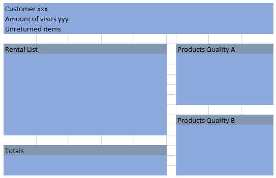
I got some code that looks nice when its "empty" and looks like…
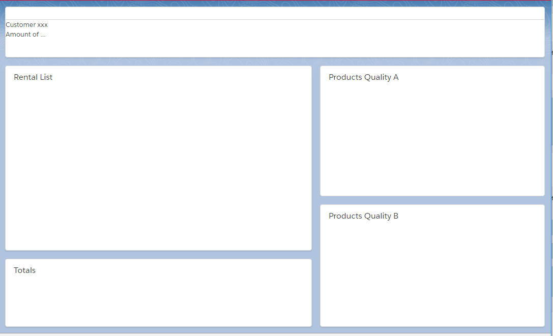
But as soon as one of the panels has a long body… it starts overflowing without scrollbar.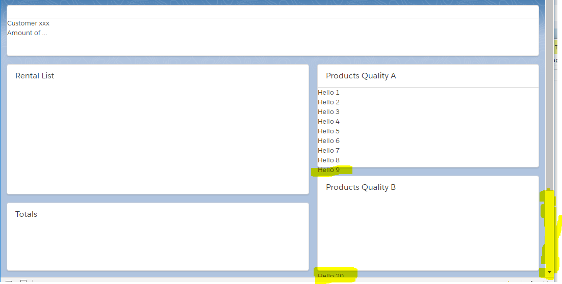
What I would like instead is to have an inner scrollbar inside the lightning:card body so the layout is kept regardless of the content of the body of the cards.
My code so far is as follows…
Style
article.slds-grid_vertical-stretch{
    height: 100%;
}
component
<div class="slds-grid slds-wrap " style="height: 100%;">
    <div class="slds-col slds-size_1-of-1 " style="height:100px;">
        <lightning:card  class="slds-grid_vertical-stretch"> Customer xxx<br/>Amount of ...
        </lightning:card>
    </div>
    <div class="slds-col slds-size_7-of-12 slds-p-top--medium slds-p-right--medium" style="height:calc(100% - 100px);">

        <div class="slds-col slds-size_1-of_1 " style="height:calc(100% - 150px);">
            <lightning:card title="Rental List" class="slds-grid_vertical-stretch">
            </lightning:card>
        </div>
        <div class="slds-col slds-size_1-of_1 slds-p-top--medium" style="height: 150px;">
            <lightning:card title="Totals" class="slds-grid_vertical-stretch">
            </lightning:card>
        </div>


    </div>
    <div class="slds-col slds-size_5-of-12 slds-p-top--medium" style="height:calc(100% - 100px);">
        <div class="slds-col slds-size_1-of-1" style="height: 50%;">
            <lightning:card title="Products Quality A" class="slds-grid_vertical-stretch">
                <span class="slds-scrollable_y" >
                    Hello 1 <br/>Hello 2 <br/>Hello 3 <br/>Hello 4 <br/>Hello 5 <br/>Hello 6 <br/>Hello 7 <br/>Hello 8 <br/>Hello 9 <br/>Hello 10<br/>
                    Hello 11<br/>Hello 12<br/>Hello 13<br/>Hello 14<br/>Hello 15<br/>Hello 16<br/>Hello 17<br/>Hello 18<br/>Hello 19<br/>Hello 20<br/>
                    Hello 21<br/>Hello 22<br/>Hello 23<br/>Hello 24<br/>Hello 25<br/>Hello 26<br/>Hello 27<br/>Hello 28<br/>Hello 29<br/>Hello 30<br/>
                </span>
            </lightning:card>
        </div>
        <div class="slds-col slds-size_1-of_1 slds-p-top--medium" style="height: 50%;">
            <lightning:card title="Products Quality B" class="slds-grid_vertical-stretch">
            </lightning:card>
        </div>
    </div>
</div>
Any ideas?
Best Answer
Using straight SLDS, use the scrollable style. In Lightning Components, you can choose to use ui:scrollerWrapper instead.
ui:scrollerWrapper