I had a similar challenge to build, but with a button. I managed to succesfully build a popup like you want, but I'm not 100% sure if it works in your code, but it's definitely worth a try.
Component
In your component you need two extra div's:
<div class="slds">
    <div aria-hidden="true" role="dialog" class="slds-modal slds-modal--prompt slds-fade-in-hide" aura:id="modaldialog">
        <div class="slds-modal__container">
            <div class="slds-modal__header slds-theme--info">
                <button class="slds-button slds-button--icon-inverse slds-notify__close" onclick="{!c.hidePopup}">
                    <c:svg aria-hidden="false" class="slds-button__icon slds-button__icon--large" xlinkHref="/resource/SLDS105/assets/icons/action-sprite/svg/symbols.svg#close">
                    </c:svg>
                    <span class="slds-assistive-text">Close</span>
                </button>
                <h2 class="slds-text-heading--medium">Your Title</h2>
            </div>
            <div class="slds-modal__content slds-p-around--medium">
                <div>
                    <p>{!v.body}</p>
                </div>
            </div>
        </div>
    </div>
</div>
This div is a hidden div (slds-fade-in-hide does that for you) which will display your form.
The second div will display a dark background:
<div class="slds-backdrop slds-backdrop--hide" aura:id="backdrop">
</div>
Controller
I assume that you have a controller to render your form, and that this form is a different component. If not, you should consider building it, as it's really easy.
Your helper class should look like this:
function_name :  function(component, event, helper){
//called on clicking your button
//run your form render code after that, run the following lines
helper.showPopupHelper(component, 'modaldialog', 'slds-fade-in-');
helper.showPopupHelper(component,'backdrop','slds-backdrop--');
}
You'll also need a function to drop the screen (on cancel for example) as you can see in my component example, I called it hidePopup, this is what's in it:
helper.hidePopupHelper(component, 'modaldialog', 'slds-fade-in-');
helper.hidePopupHelper(component, 'backdrop', 'slds-backdrop--');
Helper
You'll need a couple of methods here:
- The method to call the form component, I assume you know how to do this. The only thing you have to do here is put that component in v.body like this
component.set("{!v.body}", component);
the showPopupHelper shows the correct popup
    showPopupHelper: function(component, componentId, className){
        var modal = component.find(componentId);
        $A.util.removeClass(modal, className + 'hide');
        $A.util.addClass(modal, className + 'open');
    },
the hidePopupHelper hides it when done and, because I use this popup for multiple components, it empties the body, so that next time you'll click it, you don't get the old body first.
    hidePopupHelper: function(component, componentId, className){
        var modal = component.find(componentId);
        $A.util.addClass(modal, className+'hide');
        $A.util.removeClass(modal, className+'open');
        component.set("v.body", "");
    },
I hope it's a bit clear for you, good luck!
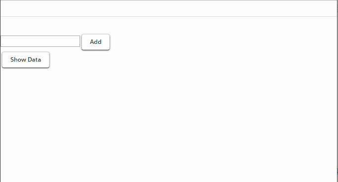
In order to bind to something dynamically, you need a reference. Here is a very basic, no-frills, slightly buggy implementation that demonstrates that this basically works.
Notice how I use component.getReference to dynamically link to a field. Also notice how I can bind to the same field twice, which literally lets me modify the same field more than once in real-time, just to prove that they are real references.
With a little more error checking and fact-gathering, this could indeed be a dynamic form with some basic describe data, etc. Notice how I do not use aura:id at all. I simply bound all the fields to a common object, and I could get and retrieve the values at will (in this case, demonstrated through Object.keys). I could also bind this object to, say, a force:recordData to dynamically save the data back to the server, or send it through a server action in Apex.
<aura:application extends="force:slds">
    <aura:attribute name="accountRecord" type="Account" default="{ 'sobjectType': 'Account' }" />
    <aura:attribute name="edits" type="Aura.Component[]" />
    <aura:attribute name="fieldName" type="String" />
    <aura:attribute name="output" type="String" />

    <aura:handler name="init" value="{!this}" action="{!c.init}" />

    {!v.output}

    <hr />

    {!v.edits}

    <ui:inputText value="{!v.fieldName}" />
    <ui:button press="{!c.addField}" label="Add" />
    <br/>
    <ui:button press="{!c.display}" label="Show Data" />
</aura:application>
({
    init: function(component, event, helper) {
        component.set("v.edits", []);
    },
    addField: function(component, event, helper) {
        var field = component.get("v.fieldName"),
            obj = component.get("v.accountRecord");
        obj[field] = "";
        component.set("v.accountRecord", obj);
        $A.createComponent(
            "lightning:input", {
                value: component.getReference("v.accountRecord."+component.get("v.fieldName")),
                label: component.get("v.fieldName"),
                type: "Text"
            },
            $A.getCallback(function(newCmp, status, error) {
                var edits = component.get("v.edits");
                edits.push(newCmp);
                component.set("v.edits", edits);
            })
        );
    },
    display: function(component, event, helper) {
        var obj = component.get("v.accountRecord");
        var results = [];
        Object.keys(obj).forEach(function(key) { results.push(key+":"+obj[key])});
        component.set("v.output", results.join('\n'));
    }
})
Here's a demo of me dynamically binding stuff:
Best Answer
Add
Customer_Name__cin default of attributeRPABot.Put 1st form and 2nd form in
aura:if, such that 1st form is shown whenCustomer_Name__cis empty. When you get back the dataCustomer_Name__cis not empty and so 1st form is removed and 2nd form is rendered.Below is the code of .cmp: