I'd like to reproduce the field that can be disabled with a checkbox with Visualforce.
Shortly:
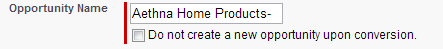
- A field should have label on the left side
- There should be a red bar indicating requirement for both the field and checkbox
- The field should be disabled/enabled on checkbox tick
I managed to solve first and get close to the second requirement with:
<apex:pageBlockSectionItem >
    <apex:outputLabel value="Opportunity Name" for="opp"/>
    <apex:outputPanel id="opp">
        <apex:inputField value="{!opportunity.Name}" required="true" />
        <apex:inputCheckbox value="{!someMapping}" id="nooppti" />
        <apex:outputLabel value="Do not create a new opportunity upon conversion." for="nooppti" />
    </apex:outputPanel>
</apex:pageBlockSectionItem>
Best Answer
If this is a custom VF-page, I would use javascript to invoke the disable/enable action - probably with jquery
The other items you list are really just "stylist" items, for example, you can inherit some of the classes to recreate the "required" (red-line) style from VF-CSS that is available on each page.