[SalesForce] lightning page custom tabs translation

and thanks in advance for any help on this subject.

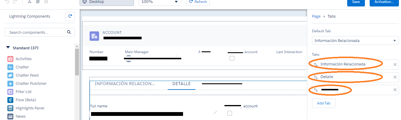
We are working with Financial Service Cloud in Lightning experience, and in the Client record Page, we have created several custom tabs.

How can enter the translation of these tabs in the system? Could it be done through the Translation Workbench, or any other Administration tools? Can it only be achieved by coding?

Again, thank you very much for any hint on this, and Season Greetings!

screenshot with the tabs "to be translated" circled

In addition, we have also problems translating the List View names (or labels). Any help on this too would be greatly appreciated.

Best Answer

From what I can tell, lightning tab translations are not directly supported in Translation Workbench, but there's a workaround.

The code for a Lightning Tab looks something like this:

<lightning:tab
           name="MyCustomTab" // or ="{!c.labelName}" 
           title="MyCustomTab" // again, or ="{!c.labelName}" 
/>

The Title and name can be replace with a custom Label. You can also add icons if you wish. To do that, you'd use CSS for the icons. You'd need to pass that label into your tab using custom markup. You'd also need to extend your existing CSS.

Once you enable Translation Workbench, Custom Labels can be translated in the Lightning Experience by going to the actual Label definition (not in Translation Workbench, but where the Custom Label is defined). Once you're there, click on it to get it's details, then from within the detail view that appears, click on "new", select the language from the options and enter the translation for the Label. Save your translation.

Depending on your implementation, you may need a controller and helper class to support the Labels that you'll be using. I've used c.labelName above simply for illustration purposes.

You can access custom labels in your markup using dynamic expression syntax as below:

{! $Label.namespace.labelName}

{! $Label.c.labelName} // if in your own org 

Aura provides native support for localization using tags like the following:

<aura:component>
    {!$Locale.language}
    {!$Locale.timezone}
    {!$Locale.numberFormat}
    {!$Locale.currenceFormat}
</aura:component> 

You can access these properties in JS as below:

({
    checkDevice: function(component) {
        var locale = $A.get{"$Locale.language");
        alert("You are using " + locale);
    }
}) 

$A.get{$Label.namespace.labelName} 
// to access a Label in a JS controller/helper function

If part of a component where you had a panel of tabs with icons on each tab, your CSS might look something similar to what's below :

@font-face {
  font-family: 'icomoon';
  src:url('/resource/AwIcons/fonts/icomoon.eot?-247d11');
  font-weight: normal;
  font-style: normal;    
}

.THIS, .THIS.mainApp, .THIS .slds-tabs--default {
  height: 100%;
}


.THIS a[role=tab]:before {
  font-family: 'icomoon';
}

.THIS li[title="{!c.labelName}"] a[role=tab]:before{
  content: "\e603";
}

.THIS .slds-tabs--default .slds-tabs__item > a {
    text-align:center;
}


.THIS .slds-tabs__content.slds-show.cTab {
  height:calc(100% - 50px);
  position: inherit;
  overflow: hidden;
}


@media only screen and (max-width: 500px) {    


  .THIS div[role=tabpanel] {
        height: calc(100% - 50px) !important;
        padding: 0px;
    }


    .THIS .uiScrollerWrapper, .THIS .slds-tabs--default {
        height: 100%;
    }

    .THIS a[role=tab]:before {
        position: absolute;
        top: -5px; 
        padding-left: 18px;
        font-size: 2em;
    } 

    .THIS li[title="{!c.labelName"} a[role=tab]:before{

        padding-left: 13px;
    }

@media only screen and (min-width:501px) {
  .THIS .slds-tabs--default__nav {
      position: fixed;
      width:50px;
      height: 100%;
      background-color: #14315D;
      display: inherit;
  } 
  .THIS a[role=tab]:before {
    font-size: 1.3em;
    color: #faebd7;
  }
  .THIS .slds-tabs--default__nav .slds-tabs__item a {
    color: transparent;      
  }  
  .THIS div[role=tabpanel] {
    margin-left: 51px;
    padding: 0px !important;
    height: 100% !important;
  }
  .THIS .slds-tabs--default .slds-tabs__item.slds-active a {
    border-bottom: none !important;
    border-right: 2px solid #0070d2 !important;
  }
}

@media only screen and (min-width:48em) {
  .THIS .slds-tabs--default__nav a {
    padding: 0 0.5rem !important;
  }

  .THIS .slds-tabs--default__nav .slds-tabs__item + .slds-tabs__item {
    margin-left: 0px !important;
  }
}

The icomoon font references in the code above are a means of converting icons into fonts for the sake of simplicity. They're especially suited to this type of usage.

Related Topic