I need a lightning-combobox (or something similar) with available for choose values. But I also want to be able to type free text and choose "add new" value and save this typed text.
I found combobox example, but don't know how to implement this "add new" value:
<template>
<lightning-combobox
        name="progress"
        label="Status"
        value={value}
        placeholder="Select Progress"
        options={options}
        onchange={handleChange} ></lightning-combobox>

<p>Selected value is: {value}</p>
import { LightningElement } from 'lwc';
export default class ComboboxBasic extends LightningElement {
value = 'inProgress';
get options() {
return [
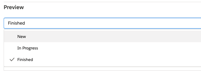
{ label: 'New', value: 'new' },
{ label: 'In Progress', value: 'inProgress' },
{ label: 'Finished', value: 'finished' },
];
}
handleChange(event) {
this.value = event.detail.value;
}
}
For example, I have 3 options in combobox ("New", "In progress", "Finished"), but I want to type "test" add choose "add new":
Best Answer
You can do this today by adding your own "+ Add New" option to the end of your array of options, then in the change handler inspecting the selected value and handling the create new action you want to take.
Something like this:
The downside is that it won't have the "+" (utility:add) icon that you see in the platform on lookup fields.
If you want that icon today, you'll have to roll your own combobox. Luckily, Salesforce has open-sourced their base components, so you can start with their c-combobox component (which has a few dependencies that you'll also have to incorporate.
https://github.com/salesforce/base-components-recipes/tree/master/force-app/main/default/lwc/combobox
Once you have this base component and its dependencies, you could modify the generateItems method to accept and pass the iconName attribute to the items list from the list of options you give the component:
Here's lines 340-352 of combobox.js:
Something like this would enable custom icon displays for items/options:
PLEASE note that this is not something I've implemented or tested, there may be side-effects that need to be addressed. For instance, this would display the icon in the space designated for the checkmark when an item is selected, and I'm not sure how passing a custom icon into the item would impact that behavior.