Could you please provide main steps of "lightning ready" certification?
Which checks application should be involved in before "lightning ready" certification?
We have an application with several custom visualforce pages and canvas app.
Visual force pages are using bootstrap.
Is it mandatory to use Salesforce Lightning Design System framework instead of bootstrap?
Lightning Ready – Salesforce Lightning Ready Certification Guide
Related Solutions
So here is my two cents
Note Per comments this does not seem to completely answer the question as OP is looking to keep classic look while providing a look that also appears well under Lightning using a single solution.
For VF components that you want to style as SLDS without having to modify the controller you need to de-componetize them. Adding styles after the DOM has been rendered as pointed out above is not great because it relies on implementation level details you have no control over. Not to mention it is just hacky...
Also, VF components just do a lot of the work for us. Unfortunately, with SLDS we are again going to need to do much of the HTML work ourselves but it is not really that bad.
Using a template approach like mentioned What is suggested approach to transfer VF pages to be lightning ready
So the idea for the code you posted would be to:
- Pageblocktable becomes an HTML table
- Use an apex repeat to build the table rows using the controller variable
- Use an input/output field with the appropriate slds styleclass in each table row
You can maintain controller and page functionality while doing this.
Bottom line is you will need to break these compound tags into HTML elements. Simple tags like input field can be used as is with the appropriate styleclass and surrounding HTML elements thus allowing you to keep built in functionality
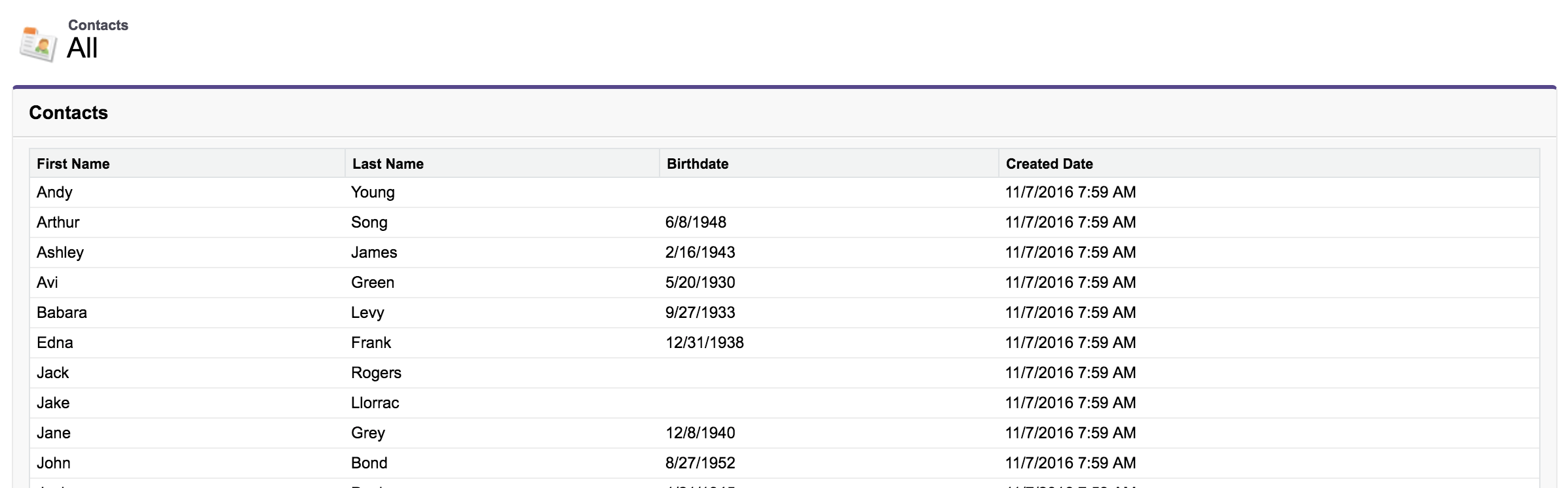
Original Markup
<apex:page standardController="Contact" recordSetVar="cs">
    <div class="slds cv">
        <apex:form>
            <apex:sectionHeader title="{!$ObjectType.Contact.labelPlural}" subtitle="All"/>
            <apex:pageMessages />
            <apex:pageBlock title="{!$ObjectType.Contact.labelPlural}">
                <apex:pageBlockTable value="{!cs}" var="c">
                    <apex:column value="{!c.FirstName}"/>
                    <apex:column value="{!c.LastName}"/>
                    <apex:column value="{!c.Birthdate}"/>
                    <apex:column value="{!c.CreatedDate}"/>
                </apex:pageBlockTable>
            </apex:pageBlock>
        </apex:form>
    </div>
</apex:page>
Output
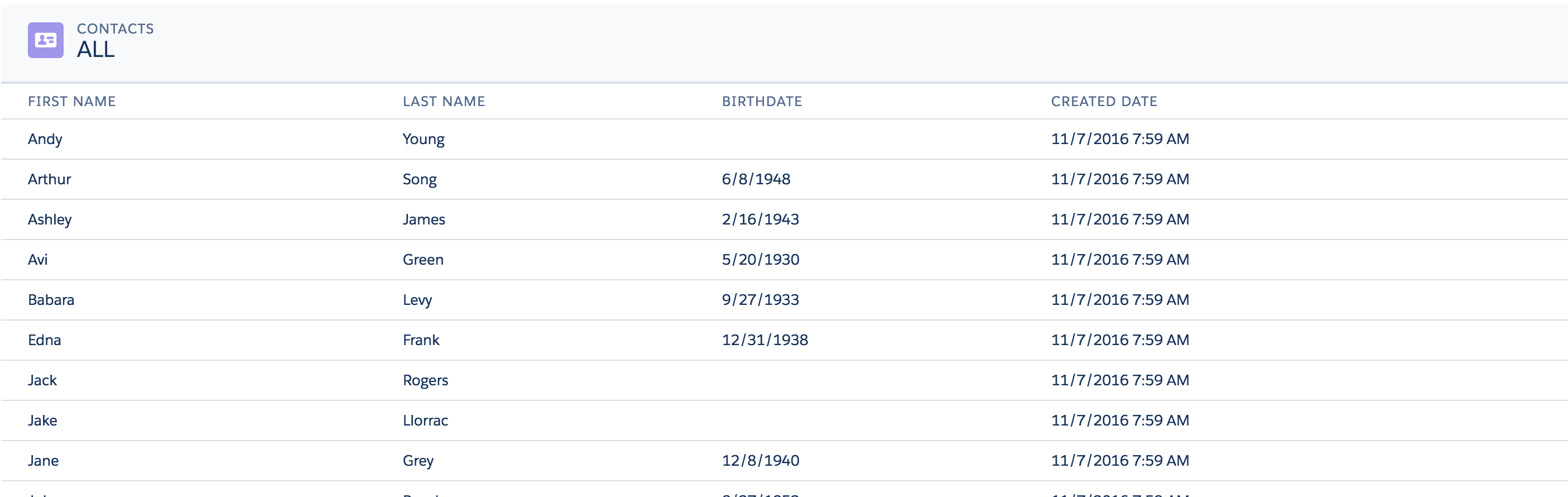
SLDS Pageblock / Pageblocktable Markup
A bit more markup but the way it is done ensures that it continues working and does not rely on the "implementation level details" of the old VF components
<apex:page id="dummySLDSPage" standardController="Contact" recordSetVar="cs" showHeader="false"
standardStylesheets="false" applyHtmlTag="false" applyBodyTag="false" docType="html-5.0">
<head>
<apex:stylesheet
value="{!URLFOR($Resource.SLDS, 'assets/styles/salesforce-lightning-design-system-vf.min.css')}"/>
</head>
<div class="SLDS">
<body>
<apex:form>
<apex:pageMessages/>
<!-- Replaces the Standard Pageblock Table Header-->
<div class="slds-page-header" role="banner" xmlns="http://www.w3.org/2000/svg"
xmlns:xlink="http://www.w3.org/1999/xlink">
<div class="slds-grid">
<div class="slds-col">
<div class="slds-media slds-no-space slds-grow">
<div class="slds-media__figure">
<svg aria-hidden="true" class="slds-icon slds-icon-standard-contact">
<use xlink:href="{!URLFOR($Resource.AppFrontier_Assets, '/assets/icons/standard-sprite/svg/symbols.svg#contact')}"></use>
</svg>
</div>
<div class="slds-media__body">
<p class="slds-text-title--caps slds-line-height--reset">{!$ObjectType.Contact.labelPlural}</p>
<p class="slds-page-header__title slds-truncate"
title="ALL">ALL</p>
</div>
</div>
</div>
</div>
</div>
<!-- Replaces the Pageblocktable Table -->
<table class="slds-table slds-table--bordered slds-table--cell-buffer">
<!-- Use a caption if desired
<caption class="slds-text-heading--label slds-p-bottom--medium">{!$ObjectType.Contact.labelPlural}</caption>
-->
<thead>
<tr class="slds-text-title--caps">
<th scope="col">
<div class="slds-truncate" title="{!$ObjectType.Contact.fields.FirstName.Label}">
{!$ObjectType.Contact.fields.FirstName.Label}
</div>
</th>
<th scope="col">
<div class="slds-truncate" title="{!$ObjectType.Contact.fields.LastName.Label}">
{!$ObjectType.Contact.fields.LastName.Label}
</div>
</th>
<th scope="col">
<div class="slds-truncate" title="{!$ObjectType.Contact.fields.BirthDate.Label}">
{!$ObjectType.Contact.fields.BirthDate.Label}
</div>
</th>
<th scope="col">
<div class="slds-truncate" title="{!$ObjectType.Contact.fields.CreatedDate.Label}">
{!$ObjectType.Contact.fields.CreatedDate.Label}
</div>
</th>
</tr>
</thead>
<tbody>
<apex:repeat value="{!cs}" var="c"> <!-- Build the columns -->
<tr>
<th scope="row" data-label="{!$ObjectType.Contact.fields.FirstName.Label}">
<div class="slds-truncate" title="{!c.FirstName}">
<apex:outputField value="{!c.FirstName}"/> <!-- Standard VF component -->
</div>
</th>
<td data-label="{!c.LastName}">
<div class="slds-truncate"
title="{!c.LastName}">
<apex:outputField value="{!c.LastName}"/>
</div>
</td>
<td data-label="{!c.Birthdate}">
<div class="slds-truncate"
title="{!c.Birthdate}">
<apex:outputField value="{!c.Birthdate}"/>
</div>
</td>
<td data-label="{!c.CreatedDate}">
<div class="slds-truncate"
title="{!c.CreatedDate}">
<apex:outputField value="{!c.CreatedDate}"/>
</div>
</td>
</tr>
</apex:repeat>
</tbody>
</table>
</apex:form>
</body>
</div>
</apex:page>
Output
The general idea would apply to the rest of the items you would like to convert. You could even go so far as spending a bit of time to make VF Components that are done in SLDS styling and used to replace existing VF components. If the project is large this could be beneficial as it would save a lot of time.
Maybe I should put a package of reusable replacement SLDS components for VF components together...hmm...There is already a library out there but it had way too much overhead and really hacked the styling.
Some additional resources:
VF SLDS Checkbox: SLDS and inputField checkbox
VF SLDS Lookup with autocomplete: Lookup Field Dual Keyboard Focus (Answered with working Autocomplete lookup component and JS example for VF/SLDS)
VF SLDS Select Checkboxes: Convert apex:selectCheckboxes into slds style
VF Page Messages Replacement: How to convert a Visualforce apex:pageMessages to be lightning style
You are probably going to want to use "events" to do this.
The approach I would consider comprises the following:
1) A Navigation component with links/buttons that fire a lightning event (this is your header)
2) The Lightning Event (a separate component - this is new to your setup)
3) A "body" component (could be one, or many) that listens for the events and changes its content dynamically (even dynamically loading other components) (this is probably your footer)
So (1) will be a component with some HTML markup including a navigation item like:
<li><a href="#" onclick="{!c.activitySelected}">Activity</a></li>
And in the component controller a method that [calls a helper method that] does:
    performActivitySelected : function() {
        var navSelected= $A.get("e.c:navSelected");
        navSelected.setParams({ "name" : "activity" });
        navSelected.fire();
    },
The navSelected var in that then references (2) which is this Lightning event (note: the name of the event component has to line up with the $A.get from above)
<aura:event type="APPLICATION" description="Event from nav">
<aura:attribute name="name" type="String"/>
</aura:event>
and then finally, in the "main" body / footer component (3) you want some markup in the component to listen to these events and change the "body" area like:
<aura:component >
    <aura:handler event="c:navSelected" action="{!c.onMenuItemSelected}"/>
    <div aura:id="displayPort"></div>
</aura:component>
In the controller then (and use the helpers appropriately to delegate this lark) use:
onMenuItemSelected : function(component, name) {
        $A.createComponent(
            "c:" + name,
            [],
            function(newComponent, status, statusDetail) {
                var content = component.find("displayPort");
                content.set("v.body", newComponent);
            }
        );
}
so when the component hears the Event being fired, it loads a component - in this case - with the given name and shoves it into it's body - but you can do anything you like from that point.
Best Answer
I don't think you will need to worry about Canvas App being embedded in your visualforce for passing through lightning ready certification for your application .Since canvas app is essentially a mashup with external system,you don't have to match CSS with lightning design system .
For lightning Ready Certification, here are key things SFDC looks in your application :
Use SLDS Design Systems for CSS in your visualforce.This is mandatory .With Bootstrap I doubt you will be able to certify your app to lightning ready .There is significant difference in both Frameworks. SLDS uses SVGs for icons .
Test for supported browsers .(IE,Firefox,Chrome,Safari)
Make sure your app is responsive and at a viewport minimum of 1024px wide and a maximum of 1920px wide. Make sure that your app responds elegantly when the left-hand nav opens and closes
Do use the new Salesforce Sans typeface. It should not be accompanied by any other typeface, with the exception of your logotype.
Try to Align with Basic Page Layouts like salesforce Edit ,List view and Detail View on Lightning experience .
In short your App should be functional in Lightning Experience and the CSS should match as closely as possible to Lightning Experience .
Here is a little screenshot on how the badge looks for apps that are lightning ready and ones that are not.