In your component markup put the SVG inside an CDATA container and surround it with DIV giving an aura:id.
<div aura:id="svg_content">
<![CDATA[
    <svg width="120px" height="120px" viewBox="0 0 120 120" version="1.1" xmlns="http://www.w3.org/2000/svg" xmlns:xlink="http://www.w3.org/1999/xlink">
        <g stroke="none" stroke-width="1" fill="none" fill-rule="evenodd">
            <path d="M120,108 C120,114.6 114.6,120 108,120 L12,120 C5.4,120 0,114.6 0,108 L0,12 C0,5.4 5.4,0 12,0 L108,0 C114.6,0 120,5.4 120,12 L120,108 L120,108 Z" id="Shape" fill="#2A739E"/>
            <path d="M77.7383308,20 L61.1640113,20 L44.7300055,63.2000173 L56.0543288,63.2000173 L40,99.623291 L72.7458388,54.5871812 L60.907727,54.5871812 L77.7383308,20 Z" id="Path-1" fill="#FFFFFF"/>
        </g>
    </svg>
]]>
</div>
Then in the renderer.js for the component, override the afterRender method:
afterRender: function(component, helper) {
    this.superAfterRender();
    var svg = component.find("svg_content");
    var value = svg.getElement().innerText;
    value = value.replace("<![CDATA[", "").replace("]]>", "");
    svg.getElement().innerHTML = value;
}
This is a workaround that works for any SVGs outside of those provided by SLDS.
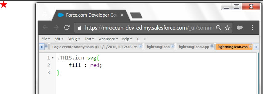
Actually the issue is which element you are applying the "fill" property to. Meaning when you declare something like <lightning:icon class="icn" iconName="utility:favorite" size="small" />.
It gets rendered as follows
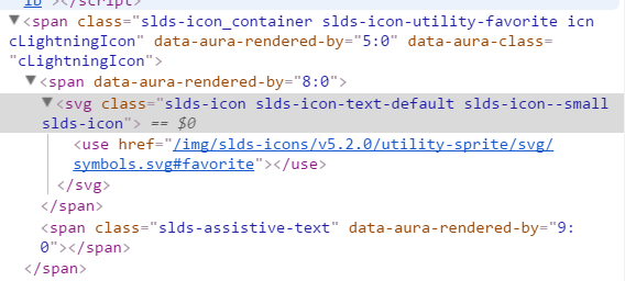
If you notice the "icn" is applied to the outer span container rather than svg itself. Hence you will have to do Something as follows to apply your custom styles. ( applying the css to the svg element using heirarchies )
Updated for LWC components. (18/03/2021)
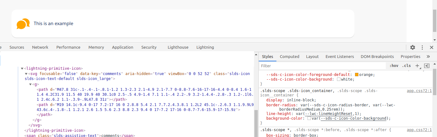
The above mentioned approach would not work for lightning web components such as lightning-icon as the web components use a shadow root property "closed" - which prevents us from modifying styles or accessing attributes from different namespaces.
Luckily Salesforce has introduced Styling Hooks for us to customize the icon styles.
Reference : https://developer.salesforce.com/docs/component-library/bundle/lightning-icon/documentation
<lightning-icon icon-name="utility:comments" alternative-text="comments" size="large" title="comments" class="comments-icn"></lightning-icon>
- Add a class attribute to the lightning-icon component.
- And add the following properties to your css class to customize icons.
.comments-icn{
   --sds-c-icon-color-foreground-default: orange; //utility icons
   --sds-c-icon-color-foreground: orange; //action icons or custom icons
   --sds-c-icon-color-background: white; //action icons or custom icons
}
For more info on Styling Hooks - https://www.lightningdesignsystem.com/components/icons/#Styling-Hooks-Overview
Best Answer
Ok, so I had to open the .css file from the lightning design system and search for these class names. It turns out that either documentation is a bit out of whack, or whoever was writing the class names became a little lazy :).
So, in order to set a background of an icon from the custom sprite, you only need to specify the icon NUMBER and not the whole icon name. For an example if you want to use the icon
custom15, the class name will be:.slds-icon-custom-15and not.slds-icon-custom-custom15