I've created a Custom Lightning Page Template Component as described here: https://developer.salesforce.com/docs/atlas.en-us.lightning.meta/lightning/components_config_for_app_builder_template_component.htm
The general use of my custom template works just fine, but I loose the sticky highlight panels in headers of the default templates. Sticky means here, if I scroll down, the header does not scroll out of view, but sticks at the top of the page.
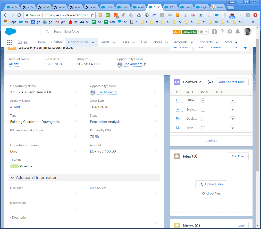
Using the native Templates provided by Salesforce, a Highlight Panel placed into the header region has a stick and shrinking behavior like below and this is what I would like in my Custom templates, too. Look only at the HL-Panel: it's shrinked in size and visible after the page is scrolled:
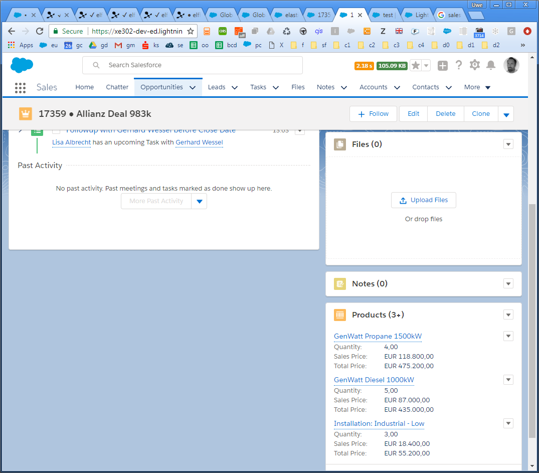
In my custom templates unfortunately I get only Highlight Panels which are not sticky, not shrinking and which are scrolling out of view, when I scroll down:
Note that I've scrolled down only a bit and the Highlight Panel is half-way out of view. Further scrolling would move the Highlight Panel including the action buttons completely out of view – which would kill usability.
Question
Is there any way to make the Highlight Panels sticke in Custom Custom Lightning Page Template Components? I'm sure what I need are the right CSS-Classes in the template – but I can't find the docs for that.
Markup
<aura:component implements="lightning:recordHomeTemplate" description="...">
    <aura:attribute name="region_header"    type="Aura.Component[]" />
    <aura:attribute name="region_left"      type="Aura.Component[]" />
    <aura:attribute name="region_right"     type="Aura.Component[]" />
    <header role="banner"  class="forceHighlightsPanel"  >
        {!v.region_header}
    </header>
    <div>
        <lightning:layout horizontalAlign="spread">
            <lightning:layoutItem flexibility="grow" class="slds-m-right_small">
                {!v.region_left}
            </lightning:layoutItem>
            <lightning:layoutItem size="{! $Browser.isDesktop ? '4' : '6' }" class="slds-m-left_small">
                {!v.region_right}
            </lightning:layoutItem>
        </lightning:layout>
    </div>
</aura:component>
Design
<design:component >
    <flexipage:template >
            <flexipage:region name="region_header"      defaultWidth="LARGE" />
            <flexipage:region name="region_left"        defaultWidth="LARGE" />
            <flexipage:region name="region_right"       defaultWidth="LARGE" />
       </flexipage:template>
</design:component>
Best Answer
I tried to inspect the classes that go behind Salesforce's standard template that make the header stick, but couldn't get it to work as quickly as I preferred, so I got going with my own way. The following is not production ready, but should help you get started should you choose to go the custom route as well: