I am fairly new to lwc development. I want to style a text so that it appears as a regular lightning component.
Everything is working well … except the styling.
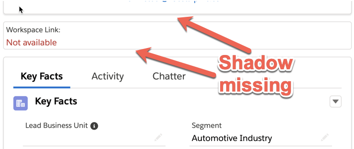
I want that the box does have a shadow and that the label and the "Not available" will be indented like the following "Key Facts" component.
Here is the code of the markup:
<template>
<template if:true={noWorkspaceId}>
        <div class="slds-box box-shadow: 0px 2px 5px silver;">
            <div class="slds-form-element slds-form-element_stacked slds-m-left_small">
                <span class="slds-form-element__label">{label}</span>
                <div class="slds-form-element__control">
                    <div class="slds-form-element__static slds-text-color_error">{notAvailable}</div>
                </div>
            </div>
        </div>
    </template>
<template>
I have tried to use padding or a margin but it does not work. Furthermore I am unable to add a shadow.
Could someone please help me?
Best Answer
There is an error in this line:
<div class="slds-box box-shadow: 0px 2px 5px silver;">You cannot add inline style in
classattribute. You could usestyleattribute, but a better choice would be rely on slds classes like.slds-tabs_card, here's the specs.Change
<div class="slds-box box-shadow: 0px 2px 5px silver;">to<div class="slds-tabs_card">in order to get the box shadowing and some padding.The "Key Facts" component is a tabset and that tab starts with a card element.
You might not need a tabset if you have only one tab.
So to achieve that style the code should be: