This is a problem I had to solve recently for extensive use within an org, so towards that end I made a more generic framework that could be plugged into any org. So I'm going to try and stick to the how of using this approach, and why I've made some of my choices within this approach, without going to heavily into why you should use this over alternatives. Caveat emptor as always :)
Check out this Gist for some boilerplate, first up (plus a few instructions in the files): https://gist.github.com/Oblongmana/6771197
Note that this solution is:
- Long. Not overly complex, but I've tried to explain EVERYTHING;
- Perhaps a bit opinionated, so feel free to critique/improve;
- A stripped down version of a first iteration, so may possibly break. Just leave a comment if it does anywhere!
The basic problem
Getting Modals to play nice is kind of unpleasant, primarily because there are many many places where css and js can clash with Salesforce. Additionally, you generally want to be up and running quickly wihtout having to do to much js, css, and messy html/vf markup.
As such, my view is that you need a framework that decouples itself from any thing "Salesforcey", is stable, and actively minimises the amount of javascript and functional css you have to write, so you can focus on data presentation instead
So towards that end, we use jQueryUI as a base - as this includes the "dialog" group of functionality - which provides you with the ability to do modals.
Get rolling with jQueryUI
As mentioned above, we want to try and be de-coupled from anything "Salesforcey", to minimise the chance of future releases breaking functionality.
As such, when we download jQueryUI, we're going to use a custom CSS scope (an option they provide you). When you define the modal area on your page later, this scope is going to ensure that the heavyweight jQueryUI css only gets applied to your modal when it's being popped, and not to anything in the main part of your page - minimising the chance of ugly css clashes.
- Go to http://jqueryui.com/download/
- Pick any components you want to include (MUST include dialog however)
- Scroll to bottom of page
- Change the CSS scope box to ".jqueryuidialog" - being sure to include the period/fullstop
- Now (and here comes the unfortunately confusing jQueryUI website user experience):
- Click the "Design a custom theme" link, and you'll be taken away from the page
- Customize the theme as you see fit (or don't, that's fine too) - I'd suggest checking out the options in the ThemeROller->Gallery tab
- Go back to the ThemeRoller->Roll Your Own tab in the left nav (if you're not already there)
- Click Download Theme
- Right, now you're back at the customised download page, and you'll see your customised css scope is still there
- Download it! :)
- Once that's done, I'd recommend doing the following:
- Unzip it.
- Rename the root folder to jqueryui
- Zip it up again, making sure the zip archive is entitled jqueryui.zip
- Upload this to SF as a public Static Resource called jqueryui.
- This should now play nice with the stylesheet import in the example we'll be working through
Get jQuery
Make sure you've got jQuery downloaded (http://jquery.com/download/) and added as a Static Resource called jQuery.
Alternatively, you could use a CDN. I personally don't - in the unlikely event the CDN has a problem while Salesforce stays up, you'll wind up with confused clients.
Set up your Visualforce page
See the Gist mentioned above for a complete example of a page - I'm just going to put relevant snippets in here.
So as mentioned above, you want to have your modal de-coupled from anything too "Salesforcey" so it won't break. As such, you are going to set up your modal in a way that avoids integrating with the rest of the page. In the below example, you'll see there's a form, containing your regular page content as usual, but then below outside of the form, there's a modal div which has two important characteristics:
- It's self-contained, holding ALL of your modal's content
- It's styled "display:none;" so it doesn't appear on your page.
Important things in terms of set up here:
- The Modal div needs a unique ID (example uses "modal-div")
- The Button to launch the modal needs class "show-modal"
- The Button to close the modal needs class "close-modal"
The launch/close buttons also have class "btn" - one of the only instances we use something "Salesforcey" (this gives the buttons a Salesforce button appearance)
<!-- primary page content -->
<apex:form>
    <apex:sectionHeader title="Content" />

    <apex:pageMessages />

    <apex:pageBlock >
        <apex:pageBlockButtons >
            <!-- pop the modal -->
            <input type="button" class="btn show-modal" value="Show Modal"/>
        </apex:pageBlockButtons>


        <apex:pageBlockSection >
            Yo, I'm your general page content
        </apex:pageBlockSection>

    </apex:pageBlock>
</apex:form>


<!-- modal popup, note the display:none; - don't touch it -->
<div id="modal-div" title="Modal Content" style="display:none;">
    Hey, I'm your modal content.
    <input type="button" class="btn hide-modal" value="Hide Modal"/>
</div>
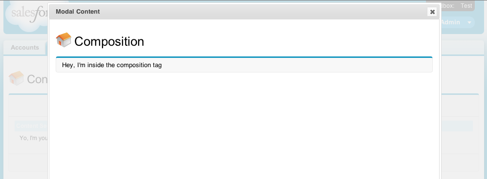
Now you mentioned that you want to put a visualforce page in the modal? Easy peasy.
Suppose I have a page called TempPage. It looks like this:
    <apex:page showHeader="true" sidebar="true">

        <apex:sectionHeader title="Composition" />

        <apex:pageBlock >
            Hey, I'm inside the composition tag
        </apex:pageBlock >

    </apex:page>
I can just change the modal's contents like so - adding the <apex:composition> tag to pull that page in:
    <!-- modal popup, note the display:none; - don't touch it -->
    <div id="modal-div" title="Modal Content" style="display:none;">
        <apex:composition template="TempPage"/>
    </div>
This displays exactly as you would expect it to, pageBlock and all. See right at the end for a picture example.
Add custom javascript to the modal's initialise, open, and close functions
So here's where it gets a bit fun, and you're going to be using some boilerplate I've already written. You can roll this yourself if you'd prefer, but I'm going to give you a quick run-down on my rationale. This file is located in the Gist mentioned above, called common-modal.js.
NOTE: that you may want to just add the file as a Static Resource and use it without reading the below, as it's not the simplest of javascript, and understanding this section fully IS NOT NECESSARY TO BEING ABLE TO USE IT IN YOUR PAGE! If this sounds like you, just add common-modal.js as a static resource called "modal", then skip down to the "Initialise your modal on the page" section.
The first function in the file is initialiseDialogs(jQueryDialogSelectorsArray). This function takes in an array of jQuery selectors. Each element in the array should a selector which grabs a div holding all of your modal's content.
This calls the jQueryUI dialog function on the modal div, with params indicating it should be a modal, width, height, etc. It also adds functions which jQueryUI will call on open and beforeClose which wrap and unwrap the modal in a div with class "jqueryuidialog" (which ensures the jQueryUI css only gets applied to the modal - this is why we did that work earlier getting the custom css scope when we downloaded jQueryUI).
initialiseDialogs : function(jQueryDialogSelectorsArray) {
    var retVal = [];
    for(var i =0; i < jQueryDialogSelectorsArray.length; i++) {
        retVal.push(
                $(jQueryDialogSelectorsArray[i]).dialog({
                  autoOpen: false,
                  height: 500,
                  minWidth: 800,
                  modal: true,
                  finishListener: function(event){
                        event.preventDefault(); //stop form submit here
                    },
                  //See http://stackoverflow.com/questions/8326853/jquery-ui-custom-css-scope-dialog-quirks
                  //   Open and Close functions ensure jQueryUI scoped css applied to (and ONLY to) the dialog
                  open: function () {
                        $('.ui-widget-overlay').each(function () {
                            $(this).next('.ui-dialog').andSelf().wrapAll('<div class="jqueryuidialog" />');
                        });
                    },
                  beforeClose: function () {
                        $('.ui-widget-overlay').each(function () {
                            $(this).next('.ui-dialog').andSelf().unwrap();
                        });
                    }
                })
            );
    }
    return retVal;
},
The next function in the file is initialiseDialogOpeners(jQueryDialogSelectorsArray,jQueryOpenerSelectorsArray). This function takes in the array of jQuery selectors which select the modal divs, and an array of jQuery selectors which selects the elements that you should click to open the modals (e.g. jQueryOpenerSelectorsArray[0].click() should open jQueryDialogSelectorsArray[1]). This gobbles the usual input event by calling preventDefault() so you don't get any unexpected form submissions!
initialiseDialogOpeners : function(jQueryDialogSelectorsArray,jQueryOpenerSelectorsArray) {
    modalRegistry = jQueryDialogSelectorsArray;
    for(var dialogIter =0; dialogIter < jQueryDialogSelectorsArray.length; dialogIter++) {
        $( jQueryOpenerSelectorsArray[dialogIter] )
              .click(
                function(modalSelector) {
                    return function (event) {
                        event.preventDefault();
                        $( modalSelector ).dialog( "open" );
                    };
                } (jQueryDialogSelectorsArray[dialogIter])
            );
    }
},
The next function in the file is initialiseDialogClosers(jQueryDialogSelectorsArray,jQueryOpenerClosersArray). This is effectively identical to initialiseDialogOpeners above, but calls .dialog("close") instead. I won't clutter this further by elaborating :)
Initialise your modal on the page
First, you need to import the Static Resources we've been fluffing around with in previous steps. Depending on how closely you followed the steps, you may need to tweak these imports slightly.
<apex:includeScript value="{!$Resource.jQuery}"/>
<apex:includeScript value="{!$Resource.modal')}"/>
<apex:stylesheet value="{!URLFOR($Resource.jqueryui, 'jqueryui/css/jqueryuidialog/jquery-ui-1.10.3.custom.min.css')}"/>
Finally (phew!), we add some code which sets up our modal and binds our open and close events. Basically, on document ready, we set up 3 arrays - one listing the modals, and then 2 others listing the opener and closer elements respectively. We then call the common-modal.js functions (described above/imported as a Static Resource)
<script type="text/javascript" language="javascript">
    $(document).ready(function()
    {
        var dialogSelectors = ["#modal-div"];
        var dialogOpenerSelectors = [".show-modal"];
        var dialogCloserSelectors = [".hide-modal"];
        modal.initialiseDialogs(dialogSelectors);
        modal.initialiseDialogOpeners(dialogSelectors,dialogOpenerSelectors);
        modal.initialiseDialogClosers(dialogSelectors,dialogCloserSelectors);
    });
</script>
Everything should now work :D
Best Answer
You could exercise your validation logic in apex using either a Visualforce page or webservice called from Javascript. There is a good webservice example here:
Best practice for calling Apex methods from custom button?
Using Visualforce you have methods for error message handling built in. The most popular post here on StackExchange outlines when to use the various Visualforce message options.
Difference between the multiple messaging options in Visualforce?
The short answer is that you need an outputPanel VF component in your page that renders if you have a message to show. Example, with Twitter bootstrap markup/styles:
And your apex class has something like this:
I think your best bet is to just include the detail of the record page on the VF "error page" so adding the apex:detail component just below your error text would make the page look just like the standard object layout but it would in fact be a VF page with your validation logic and error surfacing.