There are actually a lot of ways how to achieve what you want but I'll point you to one that is I think easiest to do.
You can use lightning:datatable base component.
So basically copy pasting example from documentation:
Component
<aura:component controller="CaseController">
<!-- attributes -->
<aura:attribute name="data" type="Object"/>
<aura:attribute name="columns" type="List"/>

<!-- handlers-->
<aura:handler name="init" value="{! this }" action="{! c.init }"/>


<!-- the container element determine the height of the datatable -->
<div style="height: 300px">
    <lightning:datatable
            keyField="id"
            data="{! v.data }"
            columns="{! v.columns }"
            hideCheckboxColumn="true"/>
</div>
Controller
({
init: function (cmp, event, helper) {
    cmp.set('v.columns', [
        {label: 'Case name', fieldName: 'Name', type: 'text'}
        {label: 'Deadline', fieldName: 'closeDate', type: 'date'}
    ]);


    helper.fetchData(cmp);
}}
Helper
({
fetchData: function (cmp) {
            var action = component.get("c.getCases");
    action.setParams({
        "recordLimit": 10
    });
    action.setCallback(this, function(response) {
        var state = response.getState();
        if (state === "SUCCESS" ) {
            var resultData = response.getReturnValue();
            component.set("v.data", resultData);
        }
    });
    $A.enqueueAction(action);
}
})
Apex method
@AuraEnabled
public static List<Case> getCases(Integer recordLimit) {
    Integer limit = Integer.ValueOf(recordLimit);
    List<Case> cases = [SELECT required Cases here LIMIT limit];
     return cases;
 }
That way you will receive Cases that you want in datatable form.
Please be advised that fieldNames in columns must match cases fields. If you want to use other names you need to create wrapper for it.
About view all button. You can for example on button click fetch all of the cases and not only 10. Or navigate to a specific list view using lightning:navigation and page reference. There is also many ways and you didnt specify what you want to do.
References:
https://developer.salesforce.com/docs/component-library/bundle/lightning:datatable/example
https://developer.salesforce.com/docs/component-library/bundle/lightning:navigation/documentation
So far I ended up with the following code in template component
<template>
    <lightning-card  title={title}>
        <!-- <template for:each={slots} for:item='slot'>
            <slot name="cancel" key={slot} slot={slot}><lightning-button label="Cancel"></lightning-button></slot>
        </template>
        <template for:each={slots} for:item='slot'>
            <slot name="save" key={slot} slot={slot}><lightning-button label="Save"></lightning-button></slot>
        </template>-->


        <slot name="cancel1" slot="actions"><lightning-button label="Cancel"></lightning-button></slot>
        <slot name="save1" slot="actions"><lightning-button label="Save"></lightning-button></slot>

        Content

        <slot name="cancel2" slot="footer"><lightning-button label="Cancel"></lightning-button></slot>
        <slot name="save2" slot="footer"><lightning-button label="Save"></lightning-button></slot>

    </lightning-card>
</template>
and the following code in the custom component
<template>
    <c-card>
        <lightning-button label="Cancel" title="Cancel" onclick={handleCancel} class="slds-m-left_x-small"
            slot="cancel1"></lightning-button>
        <lightning-button variant="success" label="Save" title="Save" onclick={handleSave} class="slds-m-left_x-small"
            slot="save1"></lightning-button>

        <lightning-button label="Cancel" title="Cancel" onclick={handleCancel} class="slds-m-left_x-small"
            slot="cancel2"></lightning-button>
        <lightning-button variant="success" label="Save" title="Save" onclick={handleSave} class="slds-m-left_x-small"
            slot="save2"></lightning-button>
    </c-card>
</template>
however, I personally consider this code ugly and repetitive and I would opt for a better and cleaner solution if such solution exists.

Best Answer
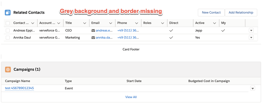
The reason you don't have the background is that in SLDS Card header does not have the background: https://www.lightningdesignsystem.com/components/cards/
The way Salesforce implements it is via Page Headers: https://www.lightningdesignsystem.com/components/page-headers/
You will have remove the
title&icon-namefromlightning-cardand implement your own<div slot="title" class="slds-page-header">. (do not include theslds-card-headeras it has extra padding).Btw: your example renders for me with border.